
Interiors · 2 min read
How Colour Changes the Feeling of a Room
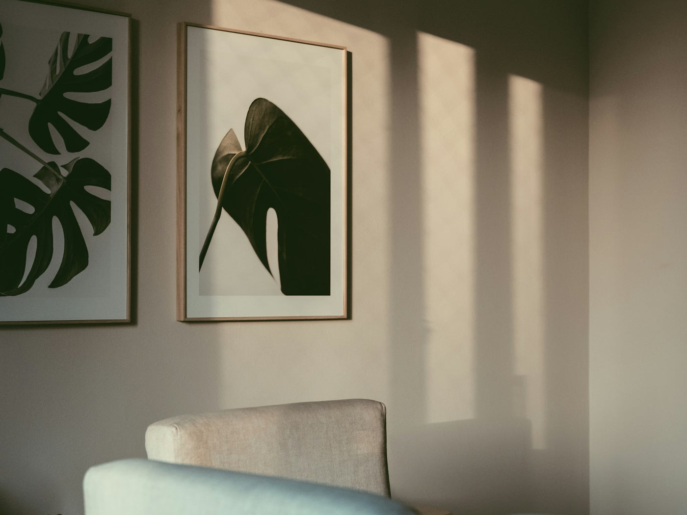
Begin with a feeling, not a colour chart
The most useful question is not “What matches my sofa?” but “How do I want this room to feel?” Soft tonal colour can make a space feel settled. High contrast adds energy. A dark, concentrated palette creates intimacy, while one luminous colour can lift an otherwise quiet room.
This leaves room for surprise. Art does not have to repeat every finish and fabric around it; it only needs a clear relationship with the space.
Notice what daylight is already doing
Look at the wall in the morning, afternoon and evening before deciding. Cool daylight can sharpen blues and greens. Warm lamps deepen reds, ochres and browns. A painting that appears restrained online may become much more present when direct or side light reaches its surface.
Choose harmony or contrast deliberately
- For harmony: repeat one secondary colour from the room rather than matching the dominant one exactly.
- For contrast: place a saturated or dark work against a pale wall and give it enough empty space to breathe.
- For a colourful room: choose a painting that connects two existing colours instead of adding several more.
Let one element make the introduction
A small echo is often enough: the green of a painting picked up by a plant, a red repeated in a book spine, or a pale frame related to the timber nearby. These quiet connections make the work feel intentional without turning the room into a matching set.
Trust the whole composition
Palette matters, but scale, subject and negative space matter too. Save images of the room and the painting side by side, then look at them in black and white. If their light and dark balance works without colour, the pairing is usually stronger than a simple shade match.
Cover photograph by Edwin Sarmiento on Unsplash.